Today, the demand for mobile-friendly websites has become non-negotiable. With about 40 million people in the UK accessing the web through a plethora of devices– from smartphones to tablets, e-readers, and beyond – ensuring compatibility across various screen sizes has become a formidable challenge.
But here's the thing: technology keeps changing, and there are always new devices popping up. In the next five years, who knows what else we'll need to design for? It seems like there's no end to it!
In the world of web design and development, it's getting harder to keep up with all these changes. Imagine having to make a separate version of your website for every new gadget and screen size—that wouldn’t be practical. So, what's the solution?
We could just accept that some people might have trouble accessing our site on certain devices. But that doesn't seem fair, does it? After all, we want as many people as possible to enjoy what we have to offer. So, maybe there's another way to tackle this problem.
In our blog, we'll dive into the world of responsive design—what it is, why it matters, and how it's shaping the future of web development and learn how our expert web developers at Inspire Digital are leading the way in crafting web experiences that adapt effortlessly to any screen size.
What is a responsive web design?
Responsive web design is a design approach that adapts to the user's behaviour and environment, such as screen size, platform, and orientation.
It involves using flexible grids, layouts, images, and CSS media queries to ensure that the website adjusts seamlessly as the user switches between devices.
For instance, when a user transitions from a laptop to an iPad, the website should automatically adjust its layout, image sizes, and functionality to suit the device's capabilities.
It's also essential to consider any device-specific settings, such as a VPN on an iPad, to ensure uninterrupted access to the website.
In essence, responsive web design enables websites to dynamically respond to the user's preferences without the need for separate design and development phases for each new device on the market. It's all about creating a fluid and user-friendly experience across various devices and platforms.
The importance of a responsive web design
Responsive web design serves several essential functions, all contributing to the overarching objectives of enhancing user experience, ensuring accessibility, and optimising search engine rankings. Let’s go into detail:
Elevating user experience
Responsive web design aims to deliver a consistent and seamless user experience across diverse devices. Whether users access a website on a large desktop screen or a compact smartphone display, they should encounter the same content and features. This uniformity is vital for retaining visitors and minimizing bounce rates.
In a study conducted by MailChimp, they found that responsive design results in a 15% increase in unique clicks among mobile users, emphasising the tangible benefits of responsive design for user engagement and interaction.
Accessibility for all users
Web accessibility is a fundamental aspect of responsive design. By guaranteeing that websites are functional and navigable across various devices, responsive design accommodates a broad user base, including individuals with disabilities who rely on assistive technologies. Responsive web design promotes inclusivity by making content easily accessible to everyone.
Enhancing mobile-friendliness
Given the growing reliance on mobile devices for internet access, having a mobile-friendly website is imperative. Responsive design addresses this necessity by automatically adjusting the layout for smaller screens. A mobile-friendly website is more likely to rank higher in mobile search results, thus contributing to SEO endeavours.
SEO advantages
Search engines like Google prioritize websites that are mobile-friendly in their search results. When a website lacks responsiveness or mobile friendliness, it may suffer in search engine rankings. Responsive web design maintains consistency in URL and content across all devices, thereby enhancing SEO and visibility in search results.
Cost-effectiveness
Responsive web design streamlines the development process by eliminating the need to create separate website versions for different devices. This not only reduces development and maintenance expenses but also ensures that any changes or updates to the website are uniformly applied across all platforms.
Future-proofing
Responsive design offers a degree of future proofing for websites. As new devices with varying screen sizes and resolutions emerge, a responsive website can adapt to these changes without necessitating extensive redevelopment or redesign.
Elements of a responsive web design
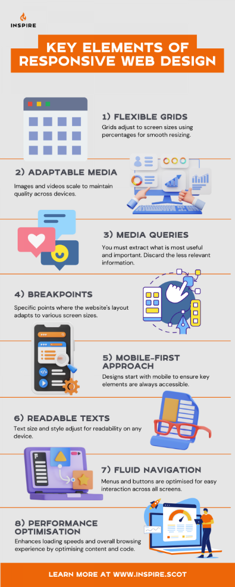
Flexible grids
Instead of sticking to fixed sizes, responsive design uses flexible grids that adjust based on percentages. This means elements on the page can resize and move around smoothly as the screen size changes.
Adaptable images and media
Pictures and videos need to be able to change size too. Responsive design makes sure they can scale up or down without looking weird or getting cut off.
Media queries
These are like instructions that tell the website how to look on different devices. They help the site adjust its layout, colours, and fonts depending on whether it's being viewed on a phone, tablet, or computer.
Breakpoints
These are moments when the layout of a website shifts to fit different screen sizes. Designers pick these points carefully to make sure the site still looks good and works well on any device.
Mobile responsiveness
One smart way to design a responsive website is to start with how it looks on a phone and then add more stuff for bigger screens. This ensures that the most important stuff is always easy to find, no matter what device someone's using.
Easy-to-read texts
The size and style of fonts can make a big difference in how easy a website is to use. Responsive design adjusts the text so it's just right for whatever device someone's using.
Fluid navigation
Ever notice how some navigation bar on some websites just disappears or looks weird when you use a different device? Responsive design also considers how people navigate the website. It ensures that menus and buttons are easy to tap or click on, regardless of the device's screen size. This helps users find what they're looking for quickly and efficiently.
Performance optimisation
Responsive design doesn't just focus on how a website looks—it also considers how fast it loads. By optimising images and code, responsive websites load quickly on all devices, providing a smooth and enjoyable browsing experience for users.
Future challenges and opportunities in responsive web design
As technology continues to evolve rapidly, responsive design faces both challenges and opportunities in adapting to the ever-changing digital landscape.
Rapid technological advancements
One of the biggest challenges for responsive design is keeping pace with new devices, screen sizes, and technologies. As new gadgets and innovations emerge, designers must continually update their approach to ensure compatibility and optimal user experience across all platforms.
Emerging interaction patterns
With the rise of voice interfaces, augmented reality (AR), and other emerging technologies, responsive design must evolve to accommodate new interaction patterns and user behaviours. Designers will need to explore innovative ways to integrate these technologies seamlessly into responsive websites while maintaining usability and accessibility.
Performance optimisation
As websites become more complex and feature-rich, optimizing performance becomes increasingly crucial. Responsive design must prioritize speed and efficiency to ensure fast loading times and smooth user interactions, particularly on mobile devices with limited bandwidth and processing power.
Accessibility and inclusivity
Ensuring accessibility for users with disabilities remains a priority in responsive design. Designers must continue to implement best practices for accessibility, such as semantic HTML, keyboard navigation, and screen reader compatibility, to ensure that websites are usable by all individuals, regardless of their abilities.
Personalisation and customisation
As user expectations evolve, responsive design presents opportunities for personalization and customisation. By leveraging data analytics and user insights, designers can create tailored experiences that adapt to individual preferences and behaviours, enhancing engagement and satisfaction.
Cross-device consistency
Achieving consistency across devices remains a significant challenge for responsive design. Designers must ensure that websites maintain visual coherence and functionality across a wide range of screen sizes and resolutions, without sacrificing usability or performance.
In conclusion, while responsive design faces various challenges in adapting to technological advancements and evolving user expectations, it also presents exciting opportunities for innovation and creativity. By embracing these challenges and leveraging emerging technologies, designers can create responsive websites that deliver exceptional user experiences across all devices.
Responsive design made simple
We're entering a new phase of web design and development. There are so many options available now and in the future that it's becoming hard to keep up with making websites fit perfectly on every screen and device.
It's time to switch gears and start building websites that are ready for whatever comes next. It's not too hard to learn how to make designs that work well for everyone, and it's a lot less stressful than trying to design and code for every single device out there.
Responsive web design, the idea we've talked about, isn't the magic solution for every problem with mobile devices. But when done right, it can make websites work better for most people. We'll need to keep learning and adapting to new devices and technology to make sure websites keep improving in the years ahead.
Responsive design isn't just good for us web designers—it's also better for the people who use our websites. Every time we make a website, we want it to be the best it can be for everyone.
With responsive design, we can make websites that work well on lots of different devices, whether it's an old laptop or the latest phone. It's about making sure everyone gets a great experience, no matter what device they're using. And that's something we aim for in every project we do.
Choose Inspire Digital for your seamless web experience on any device
Discover how our team at Inspire Digital can transform your website into a responsive masterpiece, ensuring it looks and functions flawlessly on every device. From desktops to smartphones and everything in between, our expert team combines cutting-edge technology with creative expertise to deliver an unforgettable user experience.
Contact us today to elevate your online presence and engage your audience like never before.