Independent Stirling - Logo Design
The Outcome
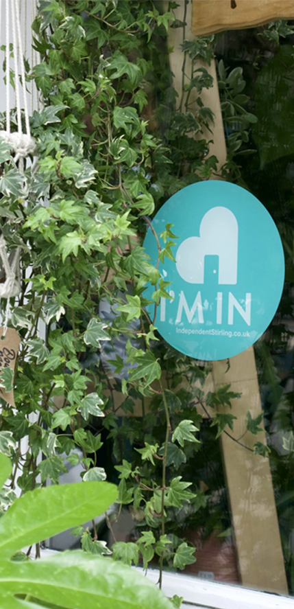
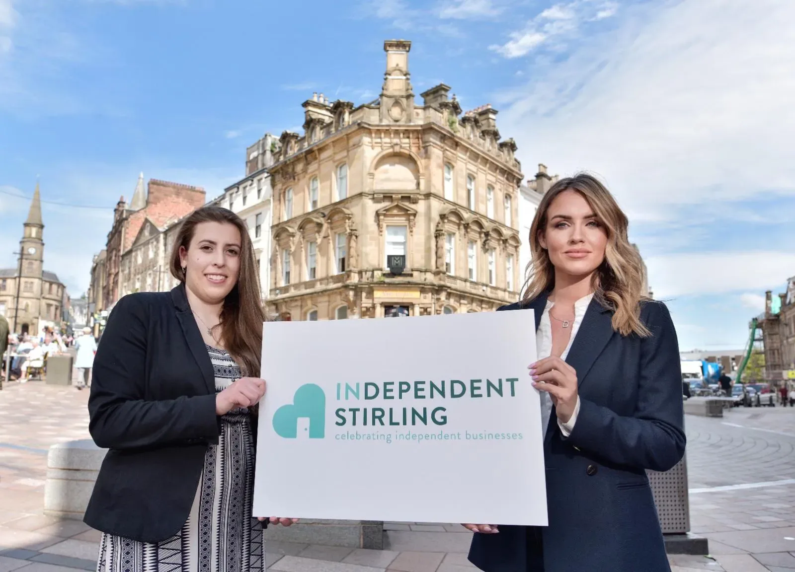
The new Independent Stirling logo is now seen all across the city, proudly displayed by local businesses. It gives them a shared identity and helps residents and visitors easily spot independents worth supporting.
The project has strengthened Stirling’s local business community and helped raise awareness of the value of buying local. The feedback from business owners has been overwhelmingly positive, with many saying the logo has helped attract new customers.
Working on this project was a great experience. We’re proud to have helped create something that celebrates local businesses and supports the community spirit that makes Stirling such a special place to shop, eat, and explore.
The Brief
Independent Stirling wanted a logo that captured the energy and pride of the city’s independent businesses. They needed something clean, modern, and flexible that would look great in different places — from small stickers to large event banners.
The logo also had to be easy to recognise and instantly connected to Stirling’s independent spirit. It needed to feel personal to business owners while being professional enough to represent the entire movement.
Key requirements
What we did
We started by learning what makes Stirling’s independents special — the creativity, hard work, and local pride that keep the city’s small businesses thriving. From there, we explored several design directions, testing colours, fonts, and symbols that could represent that spirit.
Working closely with the client, we refined the design until it felt right: clear, confident, and instantly recognisable. The final logo balances simplicity with character. It looks great in black and white or colour and can be resized for use on everything from social media posts to street banners.
The main actions we took
CLIENT FEEDBACK
Project Gallery
START YOUR JOURNEY WITH INSPIRE
Our award winning work in design & development has enabled businesses, charities, and individuals from around the world to harness online opportunities, establish a fantastic web presence, and increase their visibility and, ultimately, their enquiries and/or sales.
Please fill in this form to start the conversation with us about how we can help deliver similar results for your organisation. Give as much detail as you can, as this really helps us prepare well and do some research before getting back to you.
We look forward to hearing from you.